Components
Production-ready UI blocks composed from primitives. Click any component to preview, inspect, and copy.
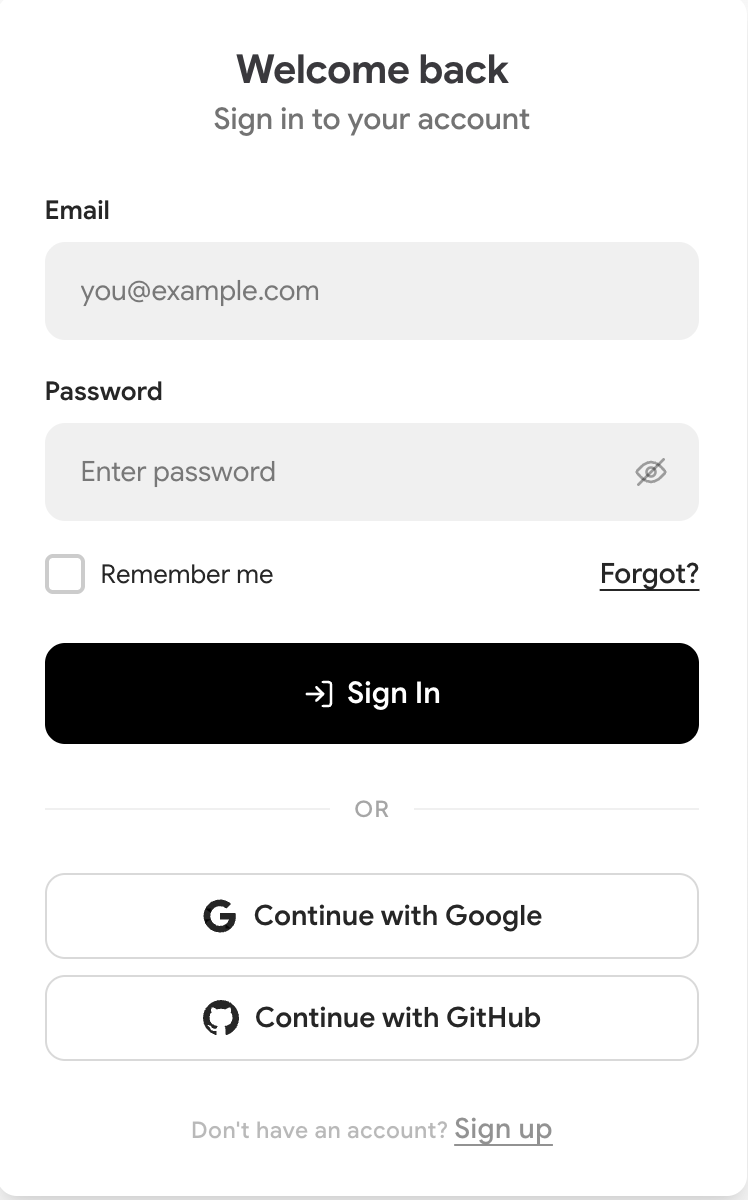
Email + password login with remember me, social login options, and signup link
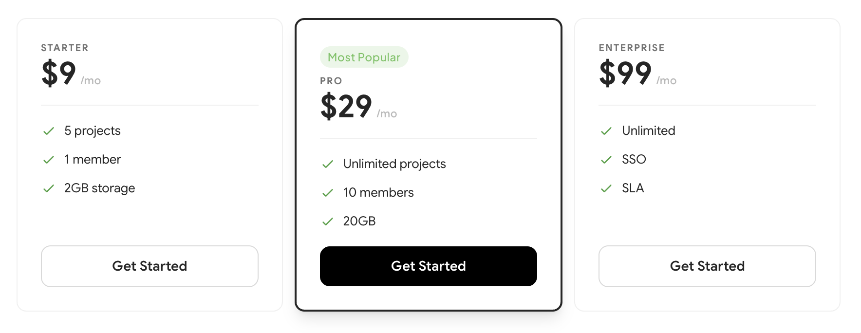
Plan name, price, feature list with checkmarks, and CTA. Popular variant inverts colors.
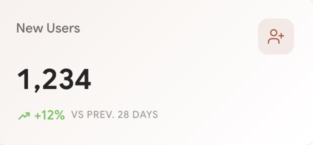
KPI metric card with icon, value, label, and trend indicator
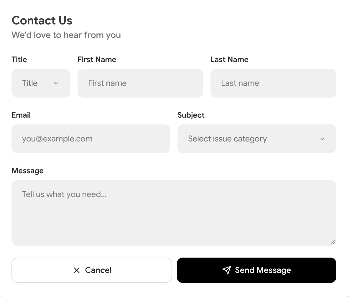
Title, first name, last name, email, subject issue category dropdown, and message textarea with submit
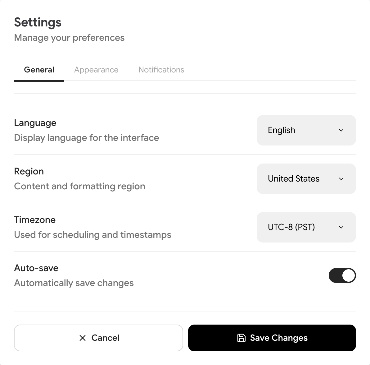
Tabbed settings with General, Appearance, and Notifications tabs
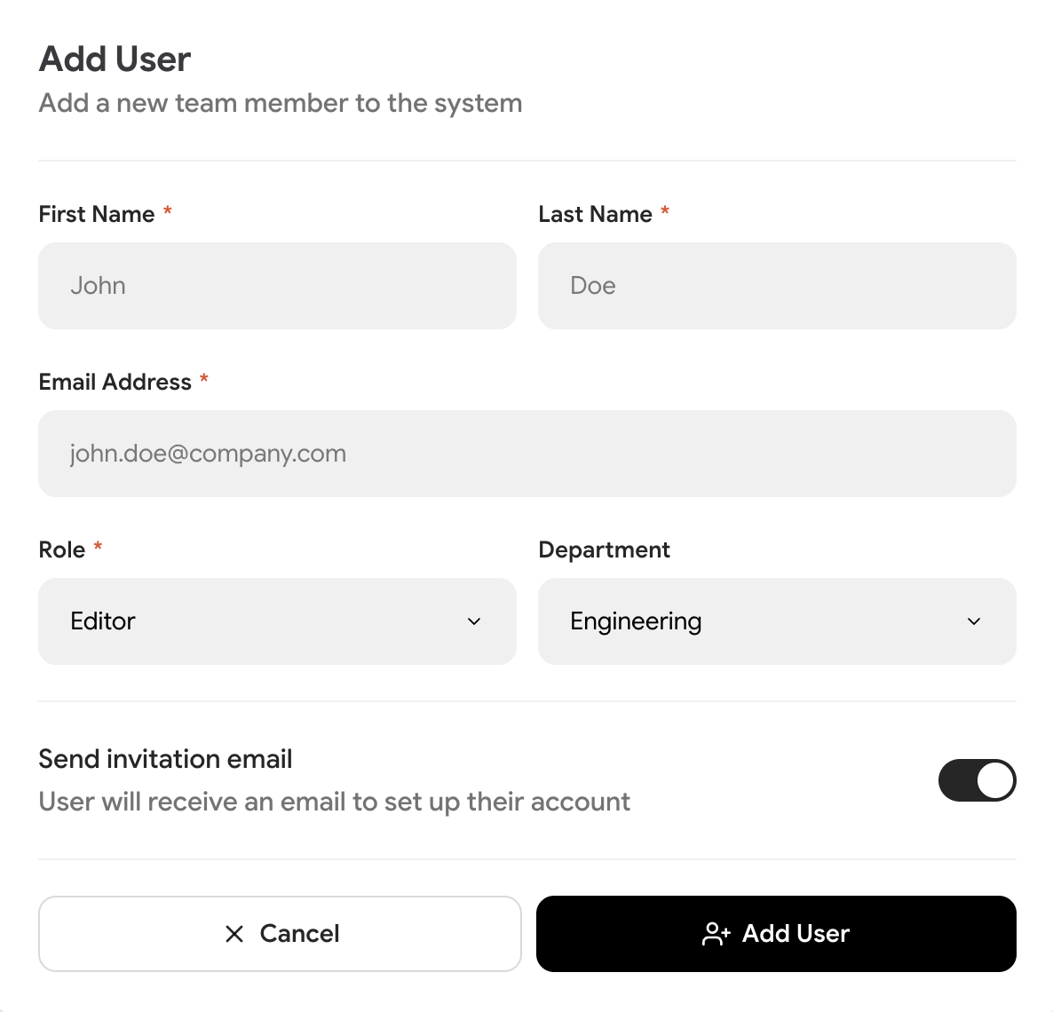
Add user form with first name, last name, email, role selector, department selector, send invite toggle, and cancel/submit actions.
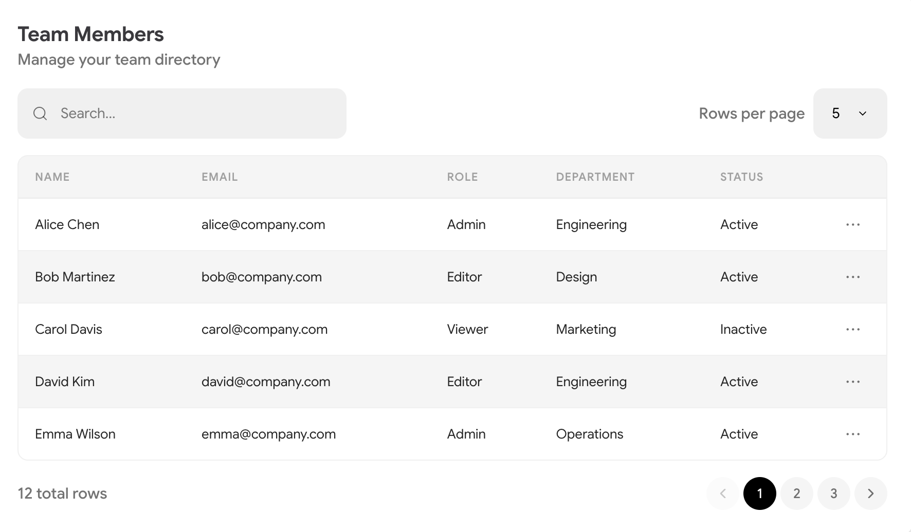
Searchable, paginated data table with configurable columns, page size selector, and responsive layout. Composed from Table, SearchInput, Select, and Pagination primitives.
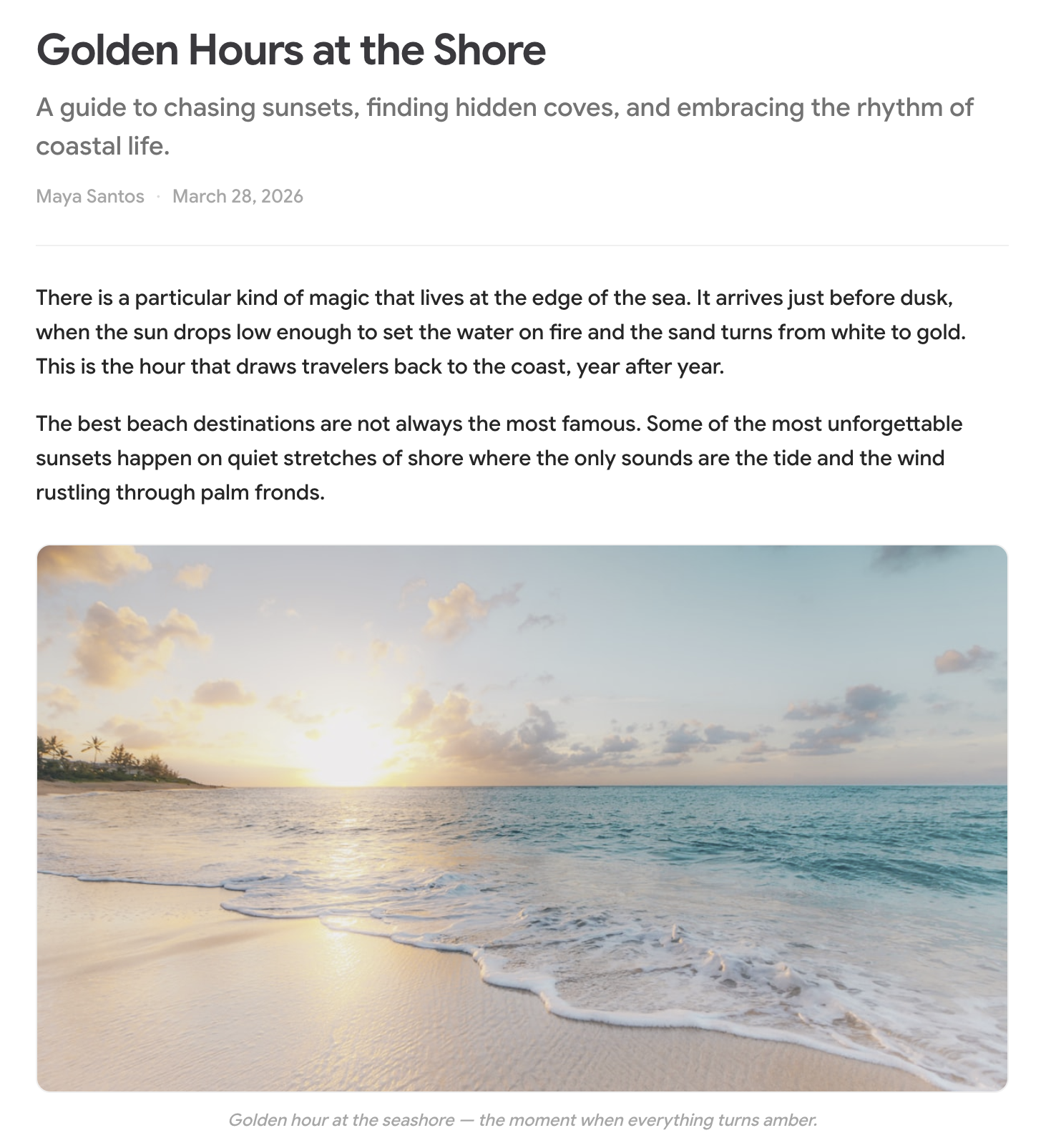
Rich blog article layout with title, subtitle, author, images with lightbox, captions, lists, and blockquotes. Composed from Heading, Text, Blockquote, List, and Stack primitives.

Single information card with icon, title, description, badge, tags and a holographic LiquidButton CTA. Driven by a single accent color.
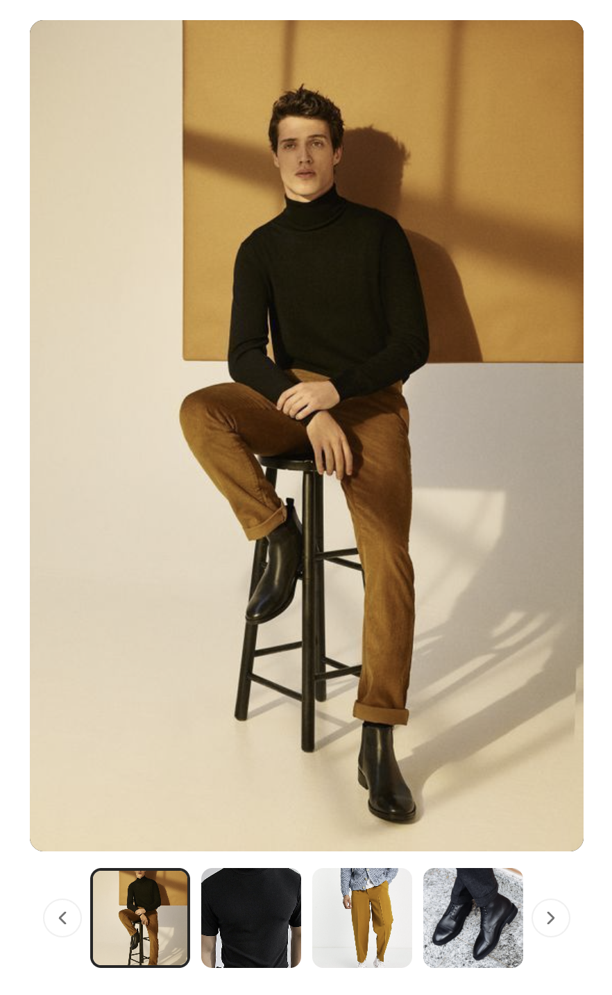
Vertical thumbnail carousel with main image preview, scroll arrows, and responsive horizontal mode.
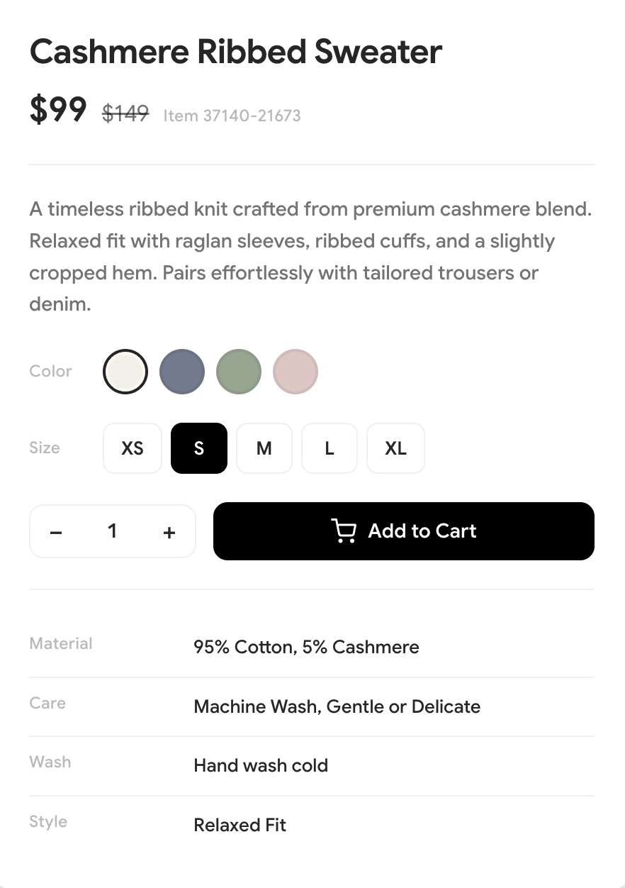
Product detail panel with title, pricing, color and size selectors, quantity stepper, add to cart, and specs table.
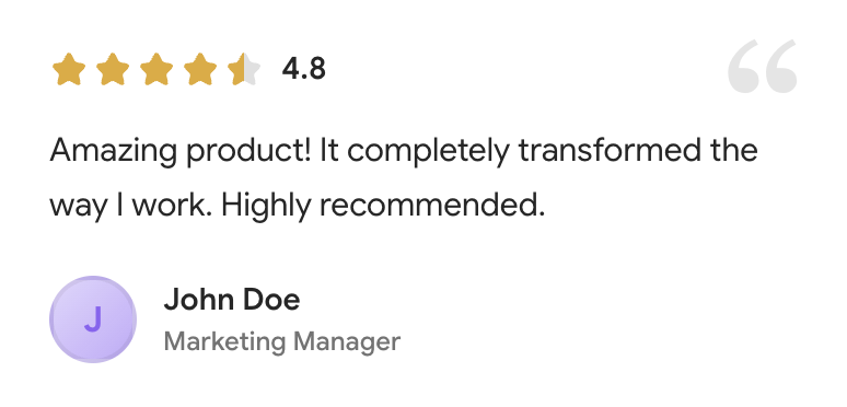
Testimonial review card with star rating, decorative quotation mark, review text, and author info with avatar.
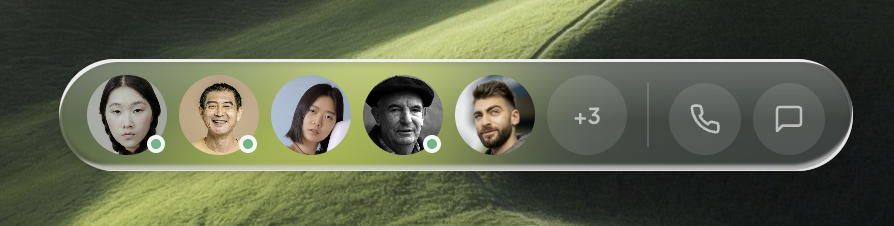
macOS-style dock bar with avatar magnification, online indicators, overflow count, and action buttons.
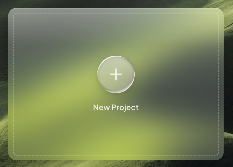
Gel-glass floating card with dashed border inset and aura gel CTA button for creating new items.
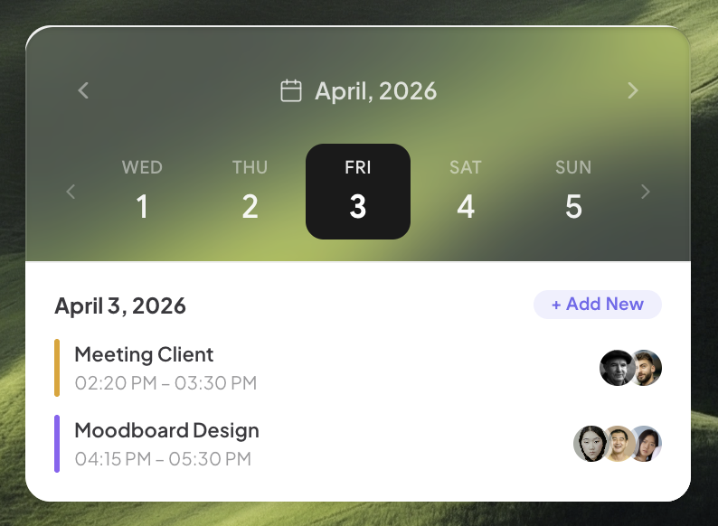
Gel-glass calendar card with WeekStrip date picker and event list with colored accent bars, AvatarGroups, and ColorPill action.
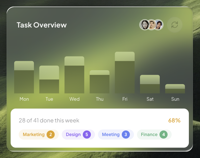
Gel-glass task overview card with animated stacked bar chart, refresh button, AvatarGroup, and ColorPill category tags with count badges.
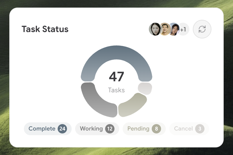
Solid card with donut chart showing task status breakdown (complete, working, pending, cancel), AvatarGroup, IconButton, and ColorPill tags with counts.
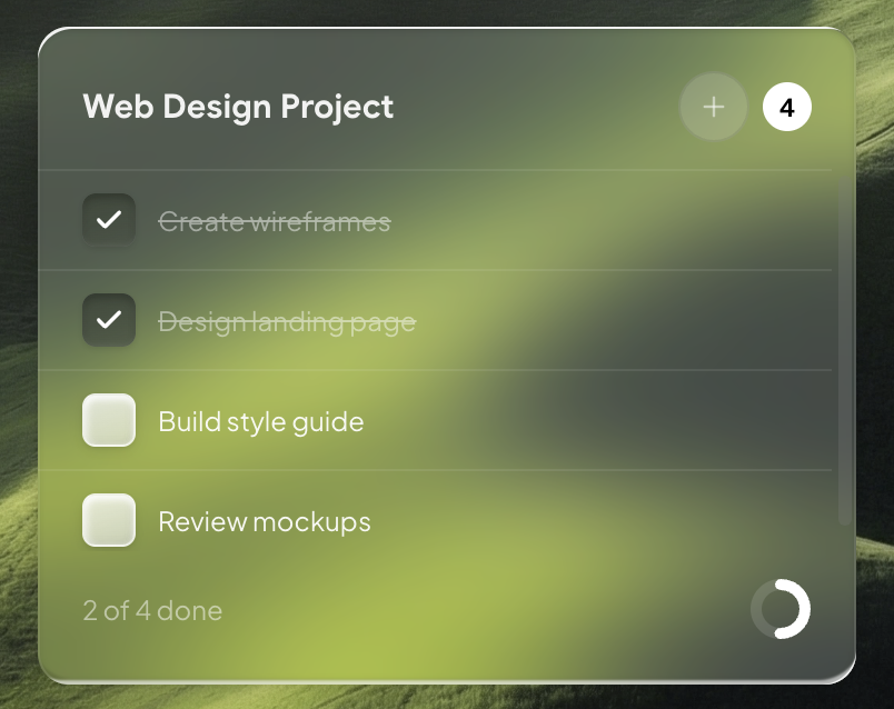
Gel-glass task checklist card with Checkbox (gel), IconButton for add/delete, contrast-aware text, solid badge/progress ring, edge-to-edge dividers, and mini scrollbar.
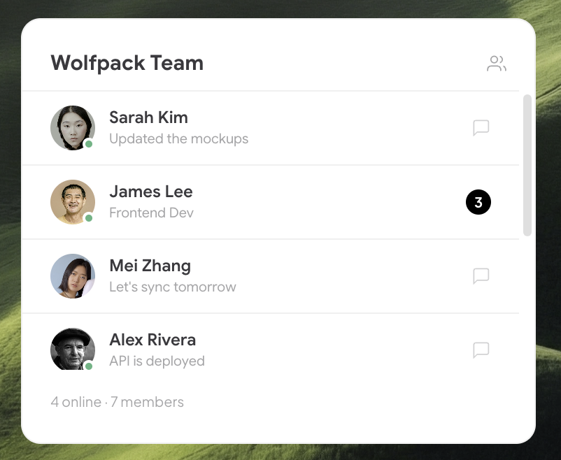
Solid card showing team members with avatar, online status, last message preview or unread badge, row dividers, and mini scrollbar.
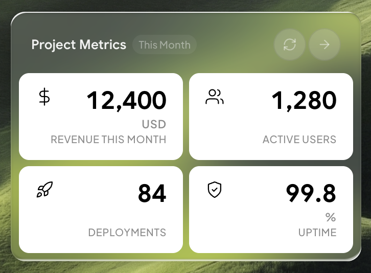
Gel-glass card with a 2×2 stat grid showing key project KPIs with animated count-up numbers, icons, units, and labels.
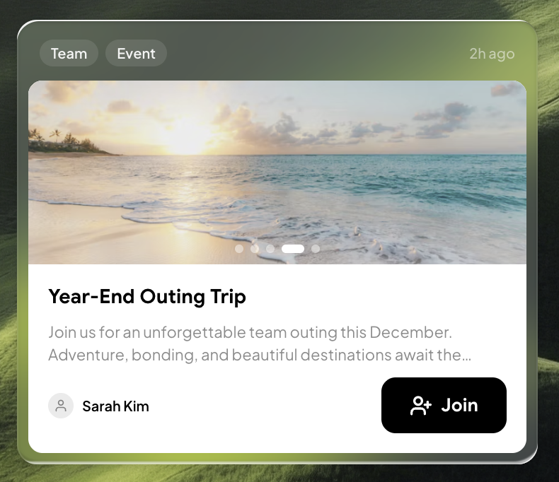
Gel-glass news update card with auto-rotating image carousel, category tags, title, excerpt, author, Join button, and timestamp.
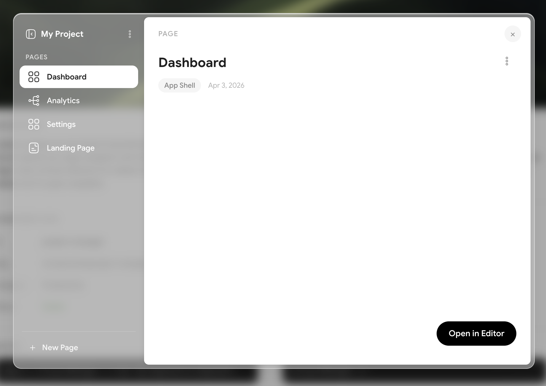
Interactive project management modal with glass sidebar navigation, page list, and shell-type icons. Opens as a draggable overlay with page CRUD operations.
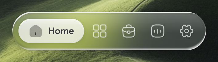
Glass pill navigation bar with icon-only buttons and active label reveal.
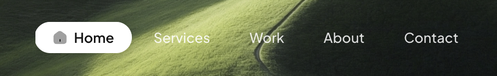
Transparent text navigation bar — active item shows icon in a solid pill that transforms to gel on hover.