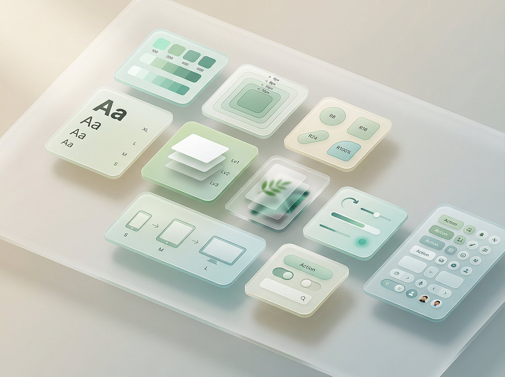
Design Tokens
Brand Colour Scheme
3 brand colours derived from logo · auto-generated scales
#78788A
Semantic Colors
Remappable intent-based tokens with light and dark variants
Text Colors
Opacity-based text hierarchy for consistent readability
Font Families
4 standard font roles — Heading, Body, UI, Mono — plus 2 optional slots for Data and Accent
H1–H6, hero text, banners, titles
Google Sans, system-ui, sans-serif
The quick brown fox jumps over the lazy dog
The quick brown fox jumps over the lazy dog
Paragraphs, descriptions, content
Google Sans, system-ui, sans-serif
The quick brown fox jumps over the lazy dog
The quick brown fox jumps over the lazy dog
Buttons, nav, labels, badges, forms
Linked to Body font
The quick brown fox jumps over the lazy dog
The quick brown fox jumps over the lazy dog
Code, tokens, technical data
SF Mono, SFMono-Regular, ui-monospace, Menlo, monospace
const token = "design-system";
const token = "design-system";
Sizes & Weights
9 sizes and 5 weights — preview in any font role
Sizes
Weights
Spacing
4px base unit system for consistent rhythm
Border Radius
8 raw values + 3 configurable presets
Raw Values
Presets
Shadow Presets
Three elevation levels — Flat, Soft, and Elevated
Glass Levels
4 depth levels for glass morphism effects
| blur | 4px |
| sat | 1.2× |
| alpha | 0.1 |
| blur | 12px |
| sat | 1.6× |
| alpha | 0.35 |
| blur | 24px |
| sat | 1.8× |
| alpha | 0.65 |
| blur | 40px |
| sat | 2× |
| alpha | 0.8 |
Glass Types
8 distinct glass effects — shown directly on your background for a real preview
Border only — fully see-through
Backdrop blur + semi-transparent background
Volumetric inset shadows + specular highlight
Layered transparency at different levels
Deepest compound layering effect
Inverted compound layering
Double volumetric depth
Volumetric element on borderless surface
Motion
Duration + easing tokens for smooth transitions
Breakpoints & Z-Index
Responsive breakpoints + layering values
Live Theming
How Appearance settings cascade to every component via CSS variables