Right-click anywhere
Change background & appearance
Astro UI Design systems for AI
that feel alive, layered, and adaptive.
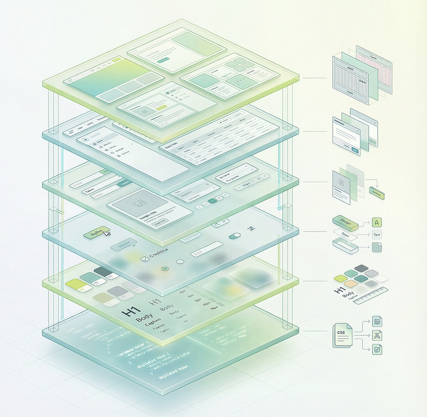
Build with a unified system that transforms tokens into fully composed interfaces. From primitives to layouts, every layer works together with precision and clarity. Adaptive glass, real-time contrast, and fluid interactions come built-in by default. Create faster, scale effortlessly, and deliver experiences that go beyond static UI.
Design System
Gel UI
Interfaces that feel
alive under your fingers.
A glassmorphism-first framework with volumetric gel surfaces, 10-layer shadow depth, adaptive contrast detection, and real-time appearance tuning. Every surface blurs, refracts, and breathes.
 Astro 5
 Astro 5
 React 19
 React 19
 Tailwind v4
 Tailwind v4
Powerful Features
Power your UI with 18 advanced capabilities across visual, interactive, and architectural layers.
useContrastColor hook samples the background via canvas to flip text/icons light or dark automatically. Works across portals, gel surfaces, and dynamic backgrounds.
10-layer volumetric inset shadow system with specular highlights, frosted blur, and gel tint. Pre-computed in JavaScript for GPU-safe rendering.
4 glass transparency levels (glass-0 to glass-3) with backdrop-filter blur, saturate, and specular gradient overlays. Configurable via appearance settings.
Astro View Transitions API for instant, SPA-like navigation without full page reloads. Background, theme, and appearance state persist across pages.
Every documentation block is a self-contained .astro component in src/components/ds/. Import and compose on any page — zero JavaScript shipped.
Right-click to adjust transparency, blur intensity, border radius, and shadow depth in real time. All glass and gel surfaces update instantly via CSS variables.
Switch between image, video, and CSS pattern backgrounds. Theme-aware filtering shows only light or dark backgrounds. Persisted in localStorage.
Custom glass context menu with appearance, background, theme, and fullscreen options. Portaled to body with contrast-aware gel styling.
Full dark mode via data-theme attribute with CSS custom properties. Every glass, gel, shadow, and text color adapts. Toggle from nav or context menu.
SVG displacement map with fractal noise, specular lighting, and composite layers for physical glass refraction on gel surfaces.
All modal panels (appearance, background picker) support mouse drag with viewport boundary clamping, re-centering on resize, and Escape to close.
Sticky gel glass nav hides on scroll down, reappears on scroll up. Active tab tracks current route with glass button highlight and icon tooltips.
Custom range input with glass track, animated fill, and gel thumb. Supports pointer drag, keyboard arrows, and accessibility labels.
Delayed glass tooltips on nav icons with instant show on subsequent hovers (300ms grace period). Portaled positioning below target element.
5 breakpoints (480–1536px) with mobile-first Tailwind utilities. Glass grid adapts from 4 columns to 1 column. Nav collapses icon labels.
prefers-reduced-motion disables animations. prefers-reduced-transparency adjusts glass opacity. Keyboard navigation and ARIA labels throughout.
Panel enter, backdrop fade, context menu scale, shimmer slide, dock rise, card enter, dot pulse, cloud drift — all with Apple-style cubic-bezier easing.
TypeScript token files for colors, typography, spacing, radii, shadows, glass, motion, and breakpoints. Drives both CSS @theme and runtime JS.
Technology Stack
Powered by modern web standards and best-in-class open source tools. Every layer is chosen for performance, developer experience, and design fidelity.
Island architecture with static-first rendering — ship zero JavaScript where you don't need it.
Interactive components hydrated only where needed via Astro islands architecture.

Full type safety across design tokens, components, hooks, and island props.
@theme tokens, @utility classes, and @custom-variant — zero runtime CSS-in-JS.

Accessible Radix-based components, re-themed with gel glass styling and tokens.

1000+ icons with Bulk, Bold, and Linear variants for consistent visual language.
Viewports & Breakpoints
6 responsive breakpoints ensure every surface adapts from pocket to panorama. Content max-width is 1400px.
max-[480px] Login icon-only, smallest padding
max-[540px] / max-[640px] 1-col grid, center nav hidden
max-[860px] 2-col grid, hero banner stacks
max-[1024px] Center nav beside logo, 4-col grid
Full layout, center nav centered
Content capped at 1400px, centered
Browser Support
Every glass and gel effect works across all modern browsers. View Transitions degrade gracefully where unsupported.
 Chrome 111+
  Edge 111+
  Safari 18+
  Firefox 128+
  Samsung 28+
  Opera 98+
 backdrop-filter: blur() CSS color-mix() CSS nesting oklch() / oklab() View Transitions (SPA) View Transitions (MPA) Project Structure
A clean codebase mapped to the 6-layer glassmorphism architecture — from design tokens to page layouts.