Patterns
Page-level compositions built from components. Click any pattern to preview full-width, inspect, and copy.
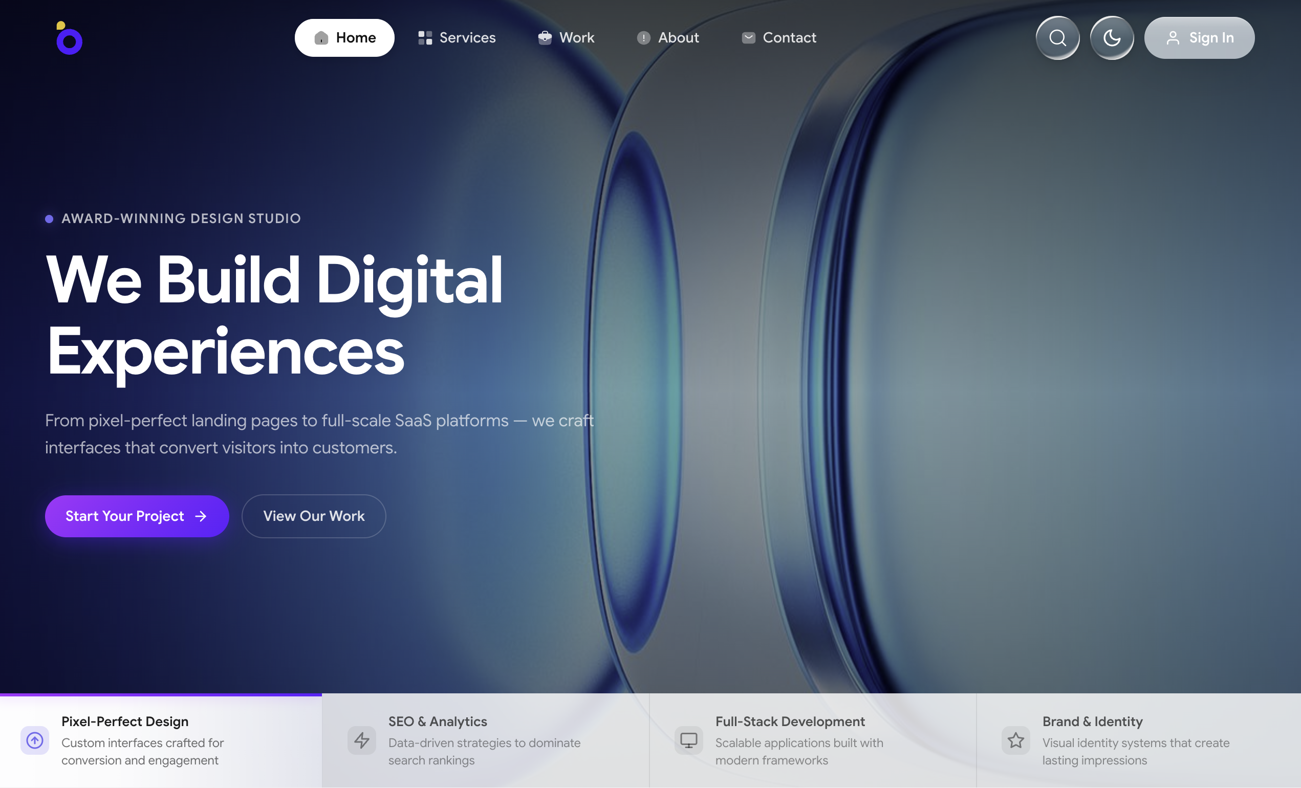
Full-viewport hero section with background image carousel, staggered text entrance animations, navigation bar with theme toggle, column-based slide indicators with progress line, and web design company content across 4 slides.
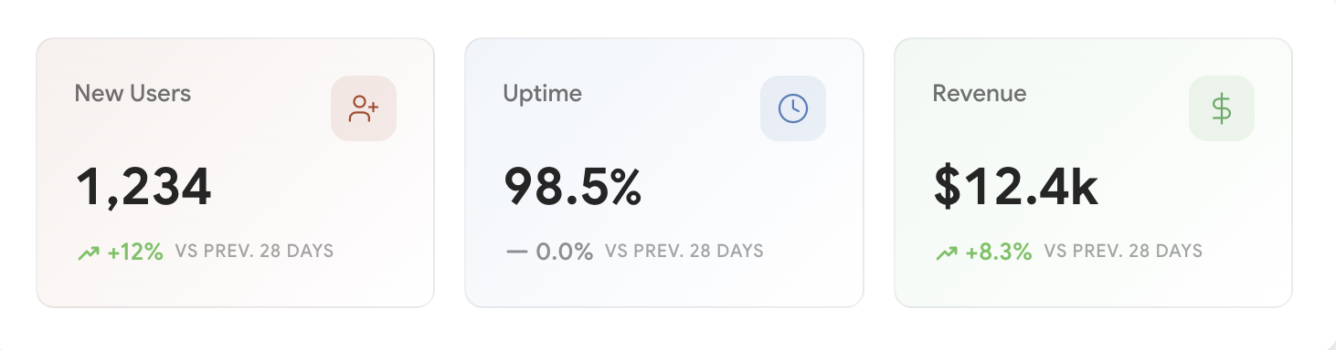
KPI stats row with 3 metric cards showing value, trend indicator, and icon in a responsive grid layout.
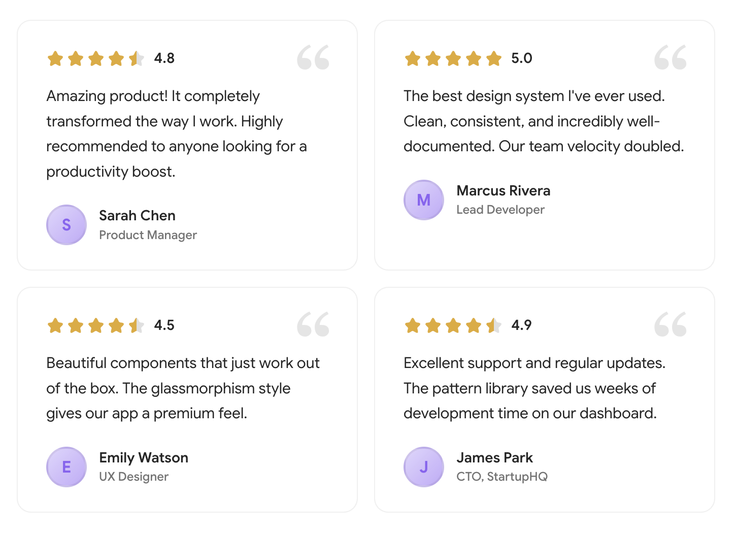
Testimonials section with 4 review cards in a responsive grid, each with star rating, quote, and author info.
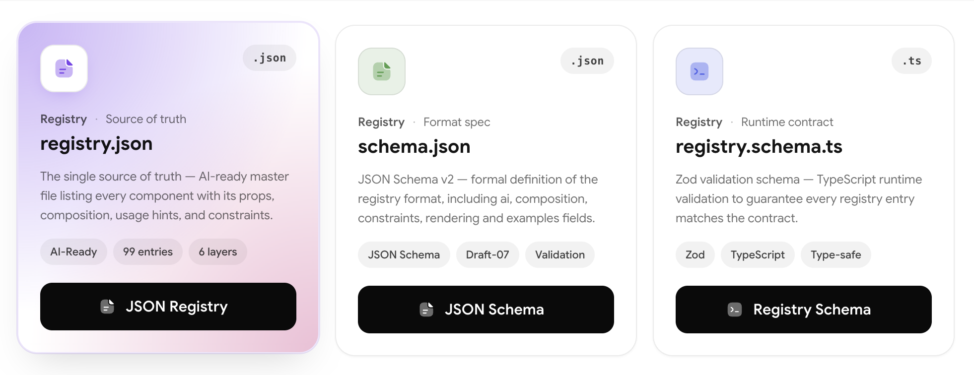
Responsive 3-up grid pattern composing InfoCard components with optional section header, overline and subheading.
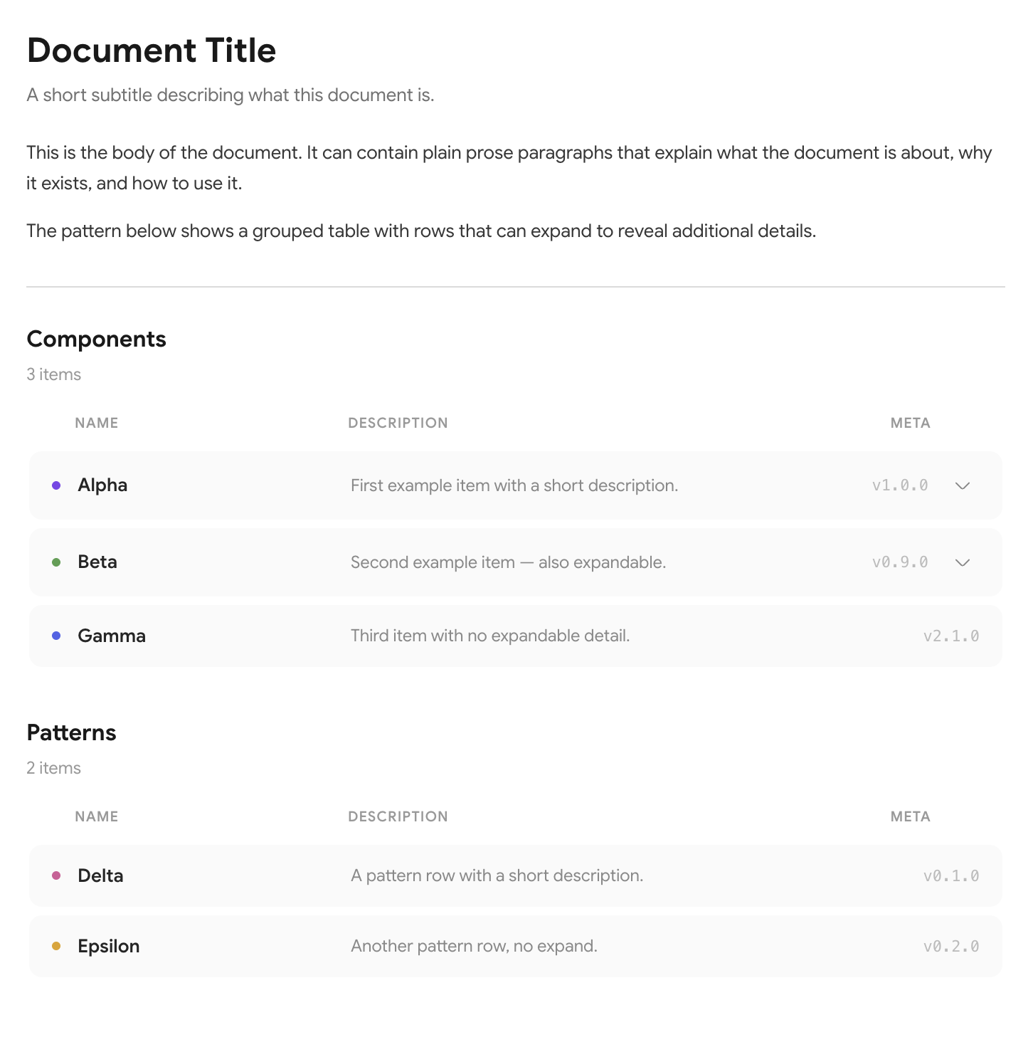
Minimal documentation panel — title, body text, and a grouped table with expandable rows.
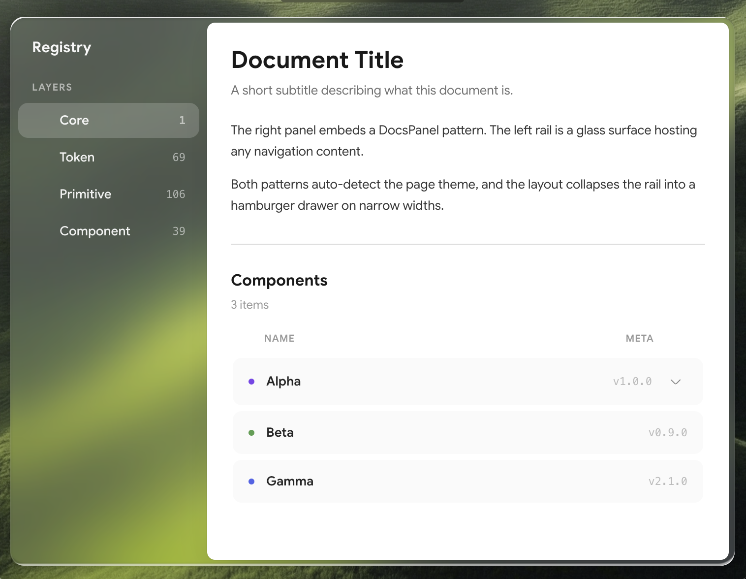
Documentation page shell — glass left rail + solid right panel that hosts a DocsPanel (or any content).
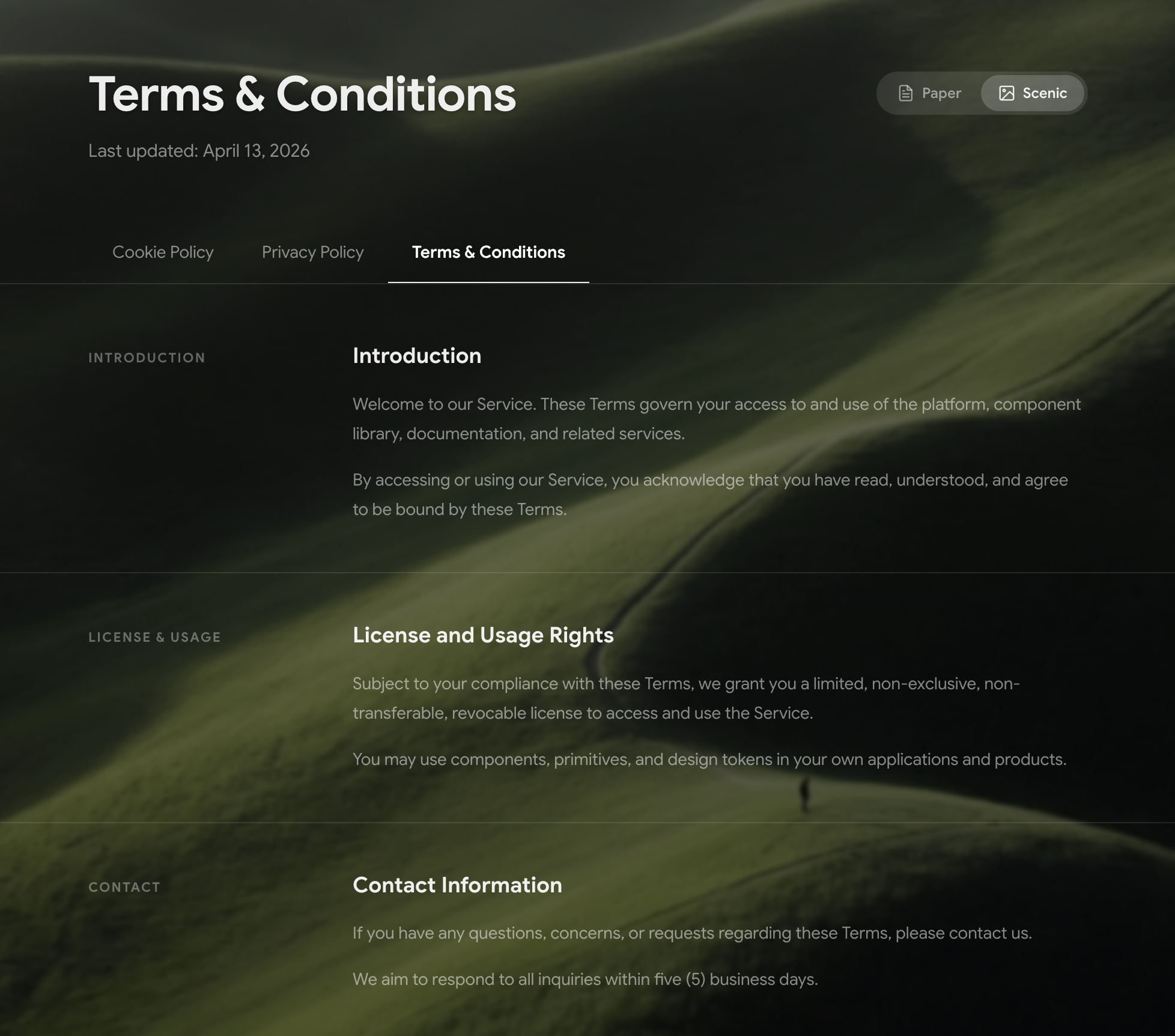
Reusable legal page pattern with resume-style layout, paper/scenic mode toggle, contrast-aware text, tab navigation, and hover effects.
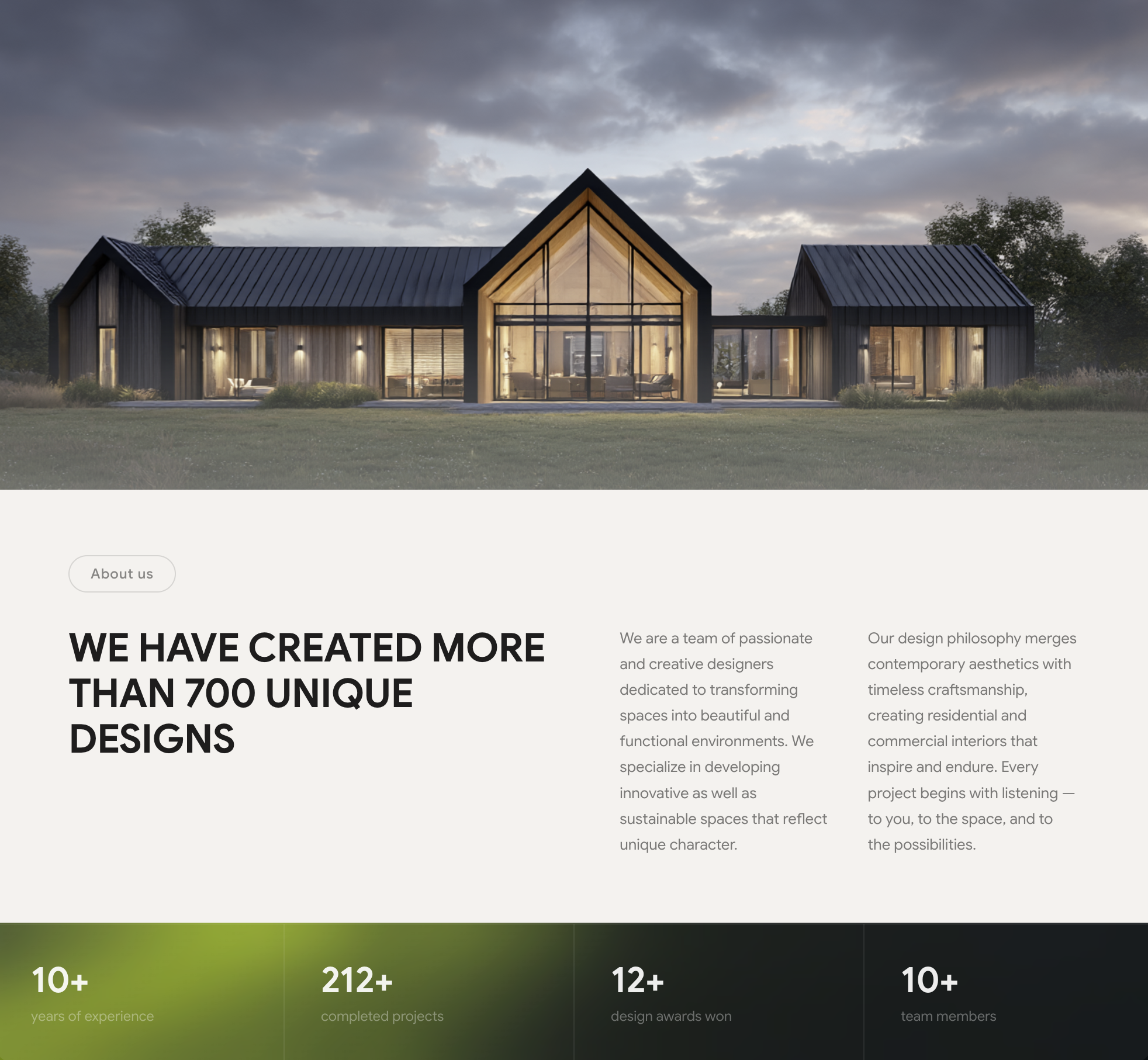
Hero image + about section pattern for architect and interior design companies with stats bar, pill badge, bold headline, and dual description columns.
Landing-page hero for a 3D / Realistic icon library — top nav with centered links, big two-line headline, supporting copy, and dual CTAs over a wide hero illustration.
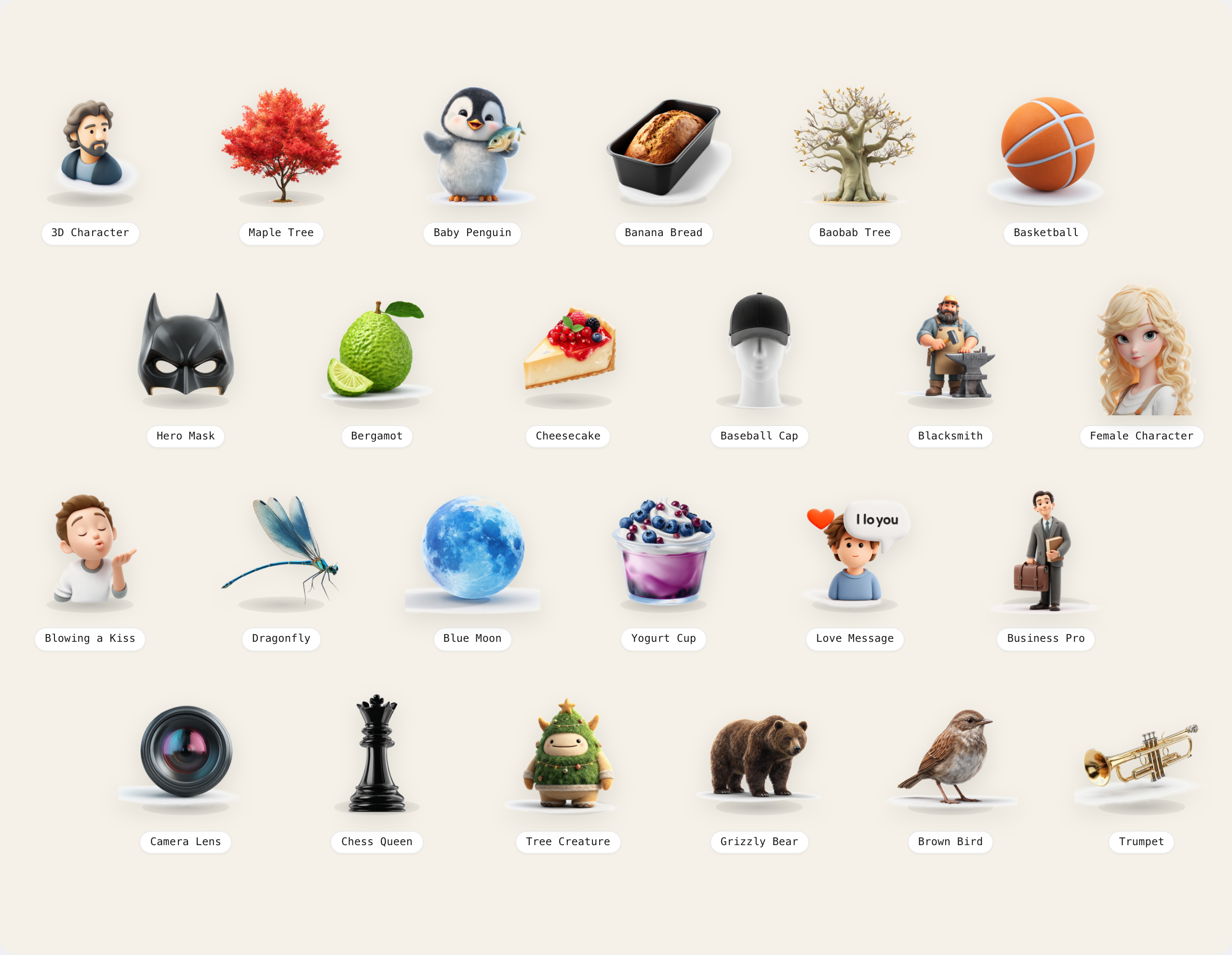
Diagonal-cascade gallery of 3D clay-style icons with monospace label pills. Each icon scales up on hover.

Responsive 3:4 portrait grid. On hover, a centered solid card covers the tile showing avatar, name and role.
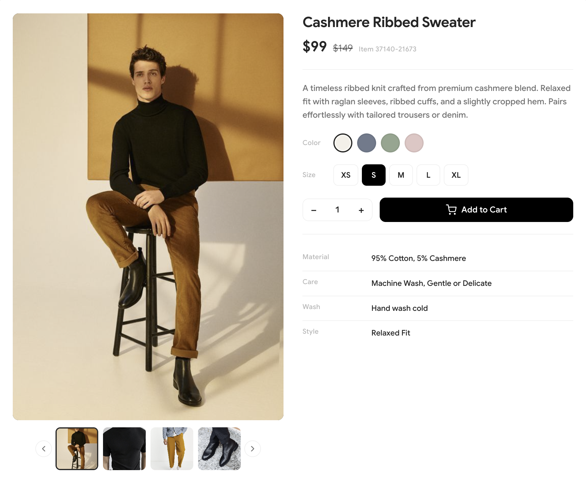
E-commerce product detail page combining image gallery with product info, pricing, color/size selectors, and add-to-cart.