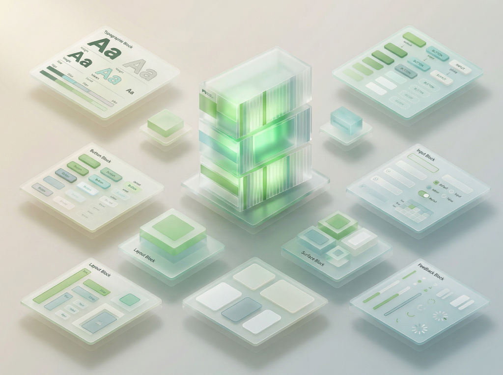
Primitives
The foundational building blocks of Gel UI. Pre-composed patterns that combine tokens into reusable typography, buttons, surfaces, inputs, and layout structures — ready to assemble into full components.
Design System — Layer 3 · Primitives
Categories
Primitives
Font Roles
Type Presets
14 typography compositions — headings, body, UI labels, and code
const theme = 'glassmorphism';var(--glass-radius)Typography Extras
Blockquotes, lists, and keyboard shortcut indicators
Good design is as little design as possible. Less, but better, because it concentrates on the essential aspects, and the products are not burdened with non-essentials.
Use the <Button> component with variant="solid" for primary actions and variant="ghost" for secondary actions. Set the size prop to "sm", "md", or "lg" to control dimensions.
Import primitives from @/primitives/buttons and configure the glass effect with CSS variables like --glass-radius and --glass-blur. The useDarkMode() hook detects theme changes automatically.
Buttons
Gel, glass, and ghost variants with sizes and states
Glass Surfaces
7 surface primitives for cards, panels, and overlays
Surfaces Extras
Expandable sections and scrollable content areas
Every surface in Gel UI is built on a foundation of translucent layers. The backdrop-filter property creates the signature frosted glass effect, while carefully tuned opacity values ensure text remains readable across any background. This approach allows interfaces to feel lightweight and contextual — the background becomes part of the design, not hidden behind it.
The token system underpinning these surfaces provides granular control over blur intensity, saturation, transparency, and shadow depth. Each parameter can be adjusted independently through the Appearance settings, allowing users to find their preferred balance between translucency and readability. Dark mode automatically inverts the appropriate values while preserving the visual hierarchy.
Primitives like Accordion and ScrollArea extend the surface concept by adding interactive behavior to contained areas. An accordion manages vertical space by revealing content on demand, while a scroll area constrains tall content within a fixed viewport with styled scrollbars. Both components inherit the design system's border radius, font settings, and dark mode tokens — ensuring visual consistency with every other primitive in the library.
Card Panels
9 panel recipes — glass, gel, and solid variants with frost options
glass-1 + ds-card-frost
Default card for text-heavy content. 95% frost ensures maximum readability on any background.
glass-1 + ds-card-frost-haze
Partial see-through card. 35% frost for showcasing visual elements with some background context.
border only — no glass
Content floats directly on the wallpaper. Border-only container for gel/glass button showcases.
glass-1 — no frost
Glass blur without frost overlay. For small cards, badges, or elements where content is short and readable.
glass-1 + token-hero-frost
Left-to-right frost. Text on the left stays readable, image/content on the right shows through.
100% opaque — no glass
Fully opaque card with no transparency, blur, or frost. Maximum contrast for data-heavy or critical content.
gel-glass + specular shine
Volumetric gel surface with inset shadows and specular highlight. Premium feel for hero content and featured items.
gel-glass + elevated shadow
Gel surface that appears to float above the background with stronger outer shadows. For modals, popovers, and elevated content.
inset shadows — recessed
Gel surface pressed into the background. Reversed shadows create a recessed/embedded feel. For input wells, content areas, and nested containers.
Dividers
10 variants — horizontal, vertical, labeled, and glass effects
Input Fields
Glass-styled form elements with validation states
Advanced Inputs
OTP pin, password, and number input primitives
Pickers
Date, date range, date-time, color picker, and week strip primitives
Badges & Labels
Status indicators, tags, and label primitives
Data Display
Tables, stat cards, empty states, and color swatches
| Name | Role | Status |
|---|---|---|
| Alice Chen | Engineer | Active |
| Bob Smith | Designer | Away |
| Carol Wu | PM | Active |
| Dan Lee | DevOps | Offline |
Charts
Line, bar, donut, area, and sparkline charts powered by Recharts
Layout
Stack, inline, center, spacer, and grid
Controls
Toggle, checkbox, radio, and segmented controls
Glass Controls
Volumetric gel-styled toggles, checkboxes, radios, and sliders
Alerts
Alert variants and toast notifications
Navigation
Interactive tab bars, breadcrumbs, and nav items
Feedback
Spinners, progress, and star ratings
Elevation
Shadow depth levels
Navigation Extras
Pagination, stepper, and scroll-to-top primitives
@/primitives/navigation and can be placed at the page level.Modals
Dialog overlays — basic, form, tabbed, confirm, and media upload
All modals are draggable glass panels using useDraggableModal hook
Tree Folder
File and folder browser with expand, collapse, and selection
Tree Menu
Editable menu tree with CRUD and reorder
Video Player
Glass-styled HTML5 video player with scrubber, volume, and fullscreen
Skeleton
Shimmer placeholders for loading states
Carousel
Auto-rotating image slideshow with crossfade, dots, and hover arrows